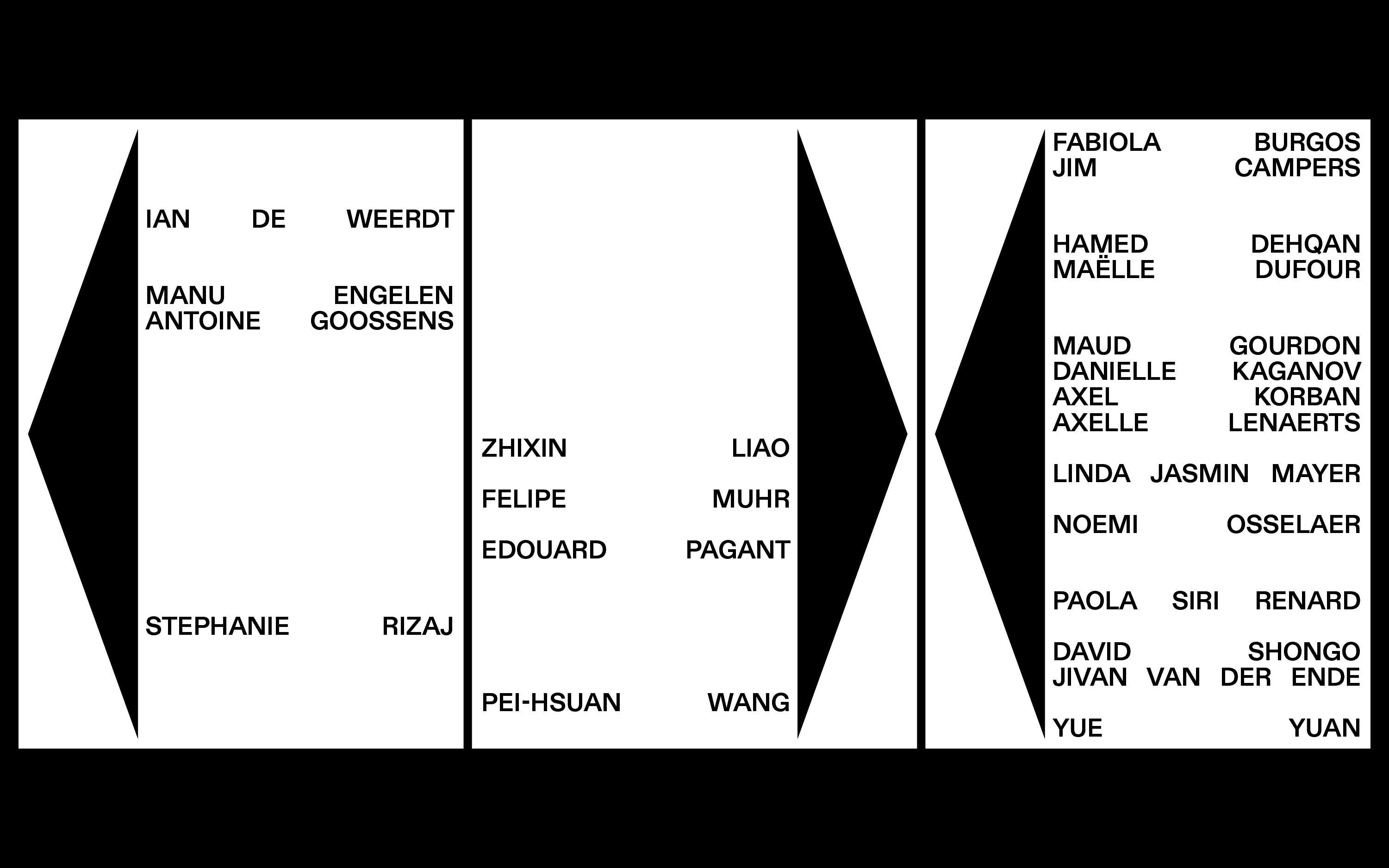
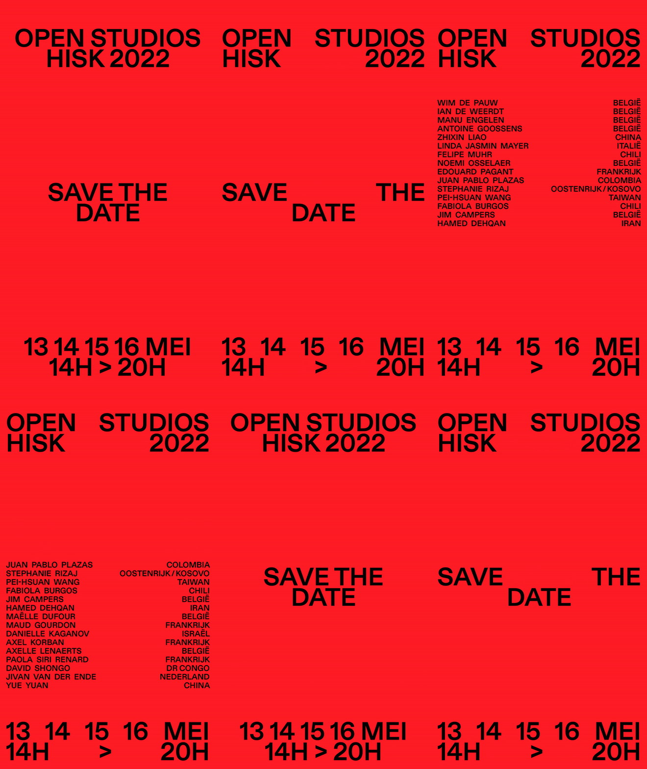
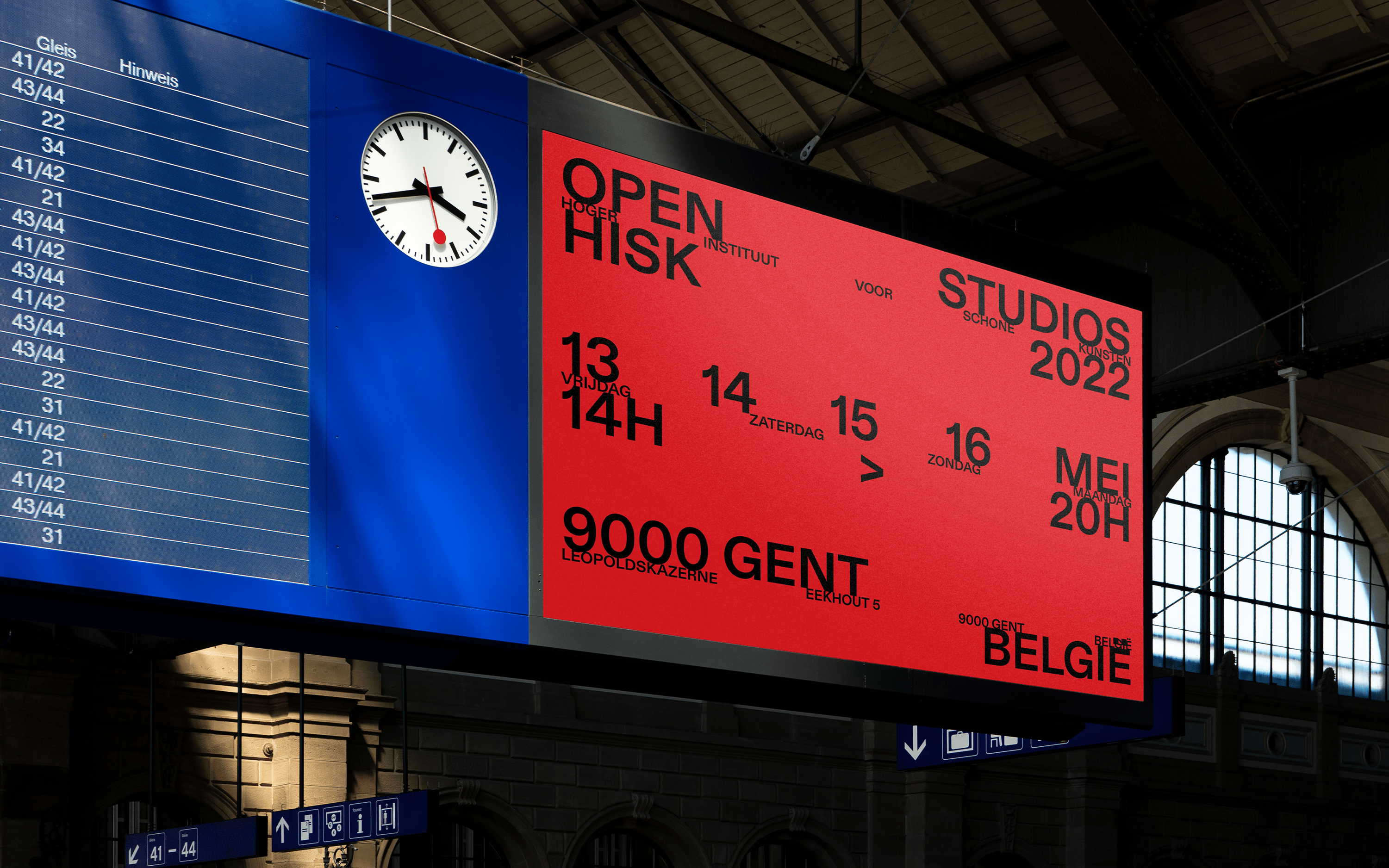
With typography as its foundation, our campaign transcends physical and digital boundaries. By integrating the artists' names as dynamic graphical elements, we artfully evoke the concept of openness, fostering an immersive experience for all.
![]()
![]()
![]()
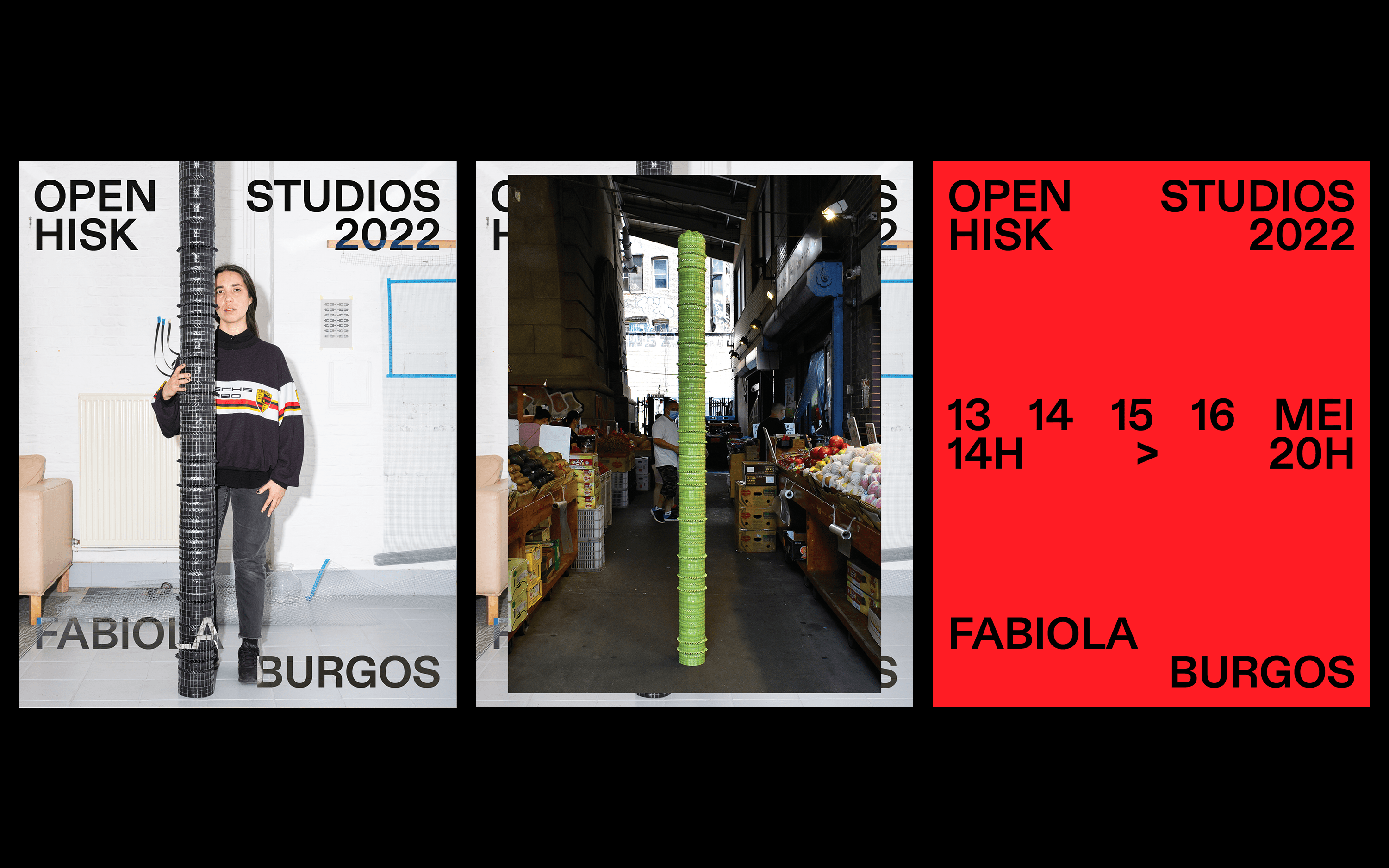
A dynamic visual identity that undergoes an exhilarating evolution while paying homage to its roots, a multi-dimensional visual campaign that unveils intriguing layers of artistic expression.
![]()
![]()
![]()
Client: HISK Belgium
Service: Visual Identity
Location: Ghent, Belgium
Year: 2022
HISK offers a post-academic course in visual arts, providing a workspace and pedagogical guidance to young artists from Belgium and beyond for two years. With an emphasis on individual practice and close interaction with a community of esteemed visiting lecturers, including artists, writers, curators, and scholars, HISK nurtures artistic growth and critical exploration within a broader aesthetic, social, and political context.
Each year, HISK opens its doors to the public, inviting them to experience the annual Open Studios event. During this period, 24 artists showcase their works, unveiling the fruits of their residency. The challenge lies in creating a visual identity that stands out within this short timeframe, while ensuring equal recognition for all artists. The focus should be on the artists themselves, rather than the institution.
Collaborating closely with HISK, we have developed a compelling visual campaign that beckons the public to explore the studios. Typography takes center stage in this campaign, which was designed for both physical and digital mediums. We ingeniously incorporated the artists' names as graphical elements, playing with the concept of openness. To infuse depth and humanity, we featured the artists' portraits as graphical elements, inviting visitors into their creative realms. Layering the pictures atop the previously designed typographical elements, we crafted a visual campaign that evolves while remaining rooted in its origins—a campaign with artistic layers.


