Taking Cecilia's homage to Edith as a starting point the visual concept for this exhibition’s visual identity was highly inspired by Cecilia's activism.
A clear message, straight to the point with bold typography. Our goal was to design a strong and clear visual identity that leaves space for reflection and dialogue.
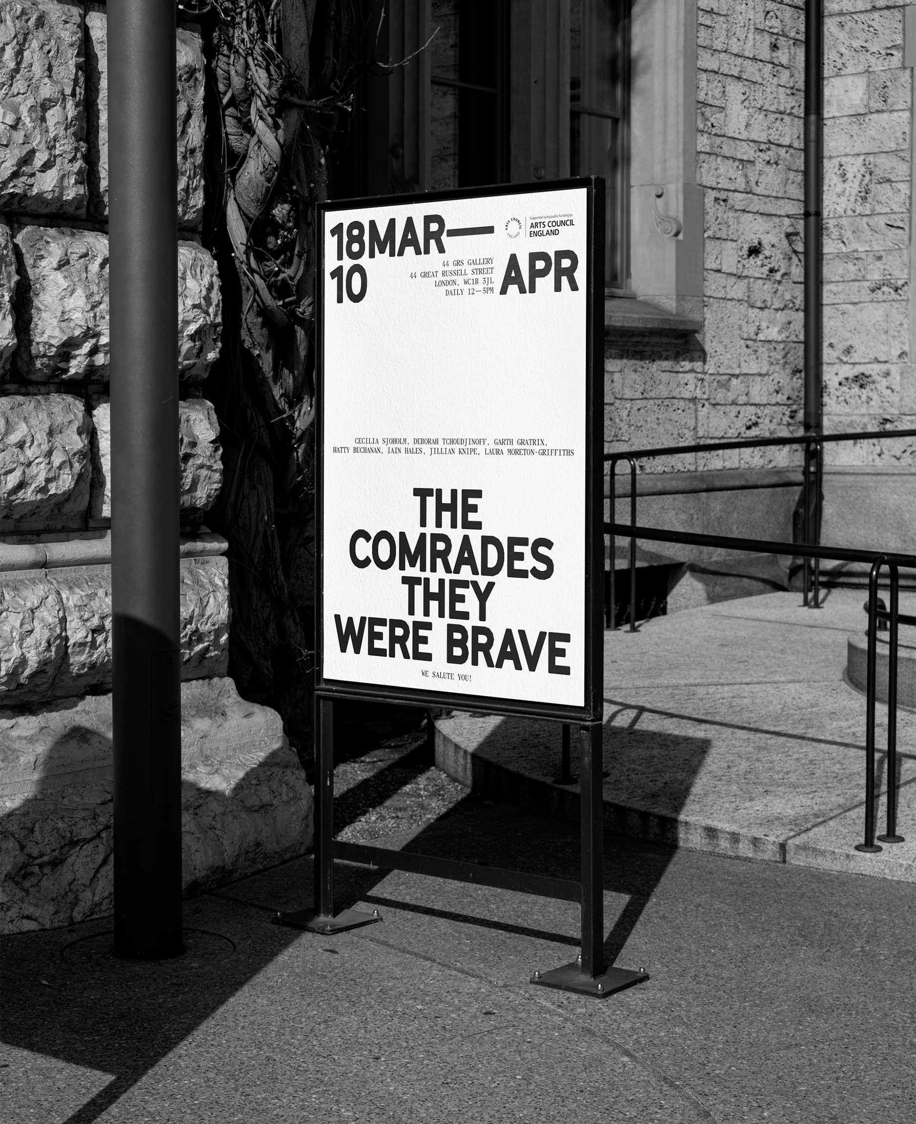
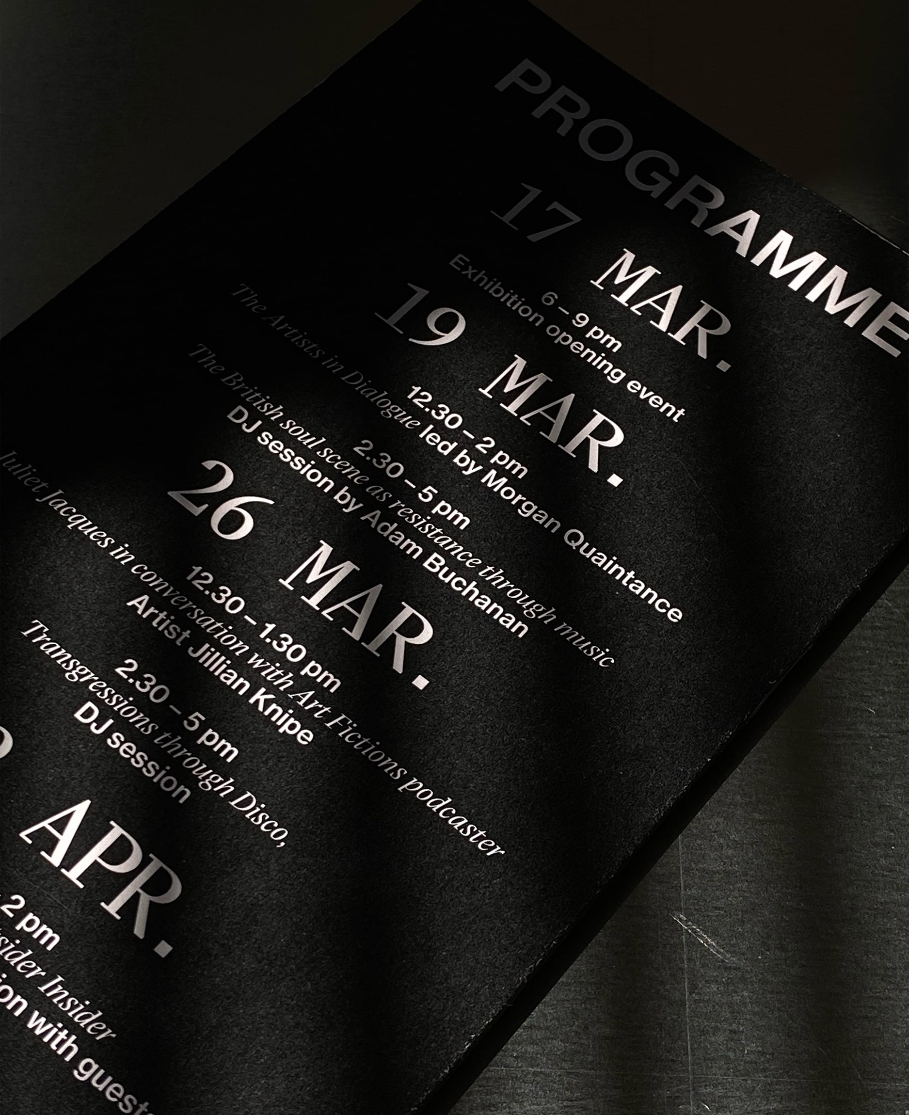
This exhibition showcases the work of a collective of artists who all embrace the spirit of defiance as a tribute to Edith Garrud and the Suffragette Bodyguard Unit. Despite working in diverse media, their artistic practices are united by a shared interest in figurative abstraction. The exhibition takes place on the second floor of the historic 44GRS gallery, situated in Bloomsbury, London. Over the course of the exhibition, each weekend will feature a series of accompanying events including talks, discussions, music, screenings, and readings. It will be a festival celebrating the courageous, the buoyant, and the mischievous.
The participating artists in this exhibition have been invited to draw inspiration from Edith and the Bodyguard Unit, using them as a starting point to explore the theme of fighting for one's rights and the most fundamental of issues – the freedom to be oneself. The artworks in this exhibition delve into the concept of finding courage amidst fear, standing up against injustice, and creating spaces for self-expression and inclusivity. Stories of collective or individual efforts to transform the status quo are perpetual, existing in the past, present, and future. We ponder whether we openly fight in the public eye or operate as escape artists, living on the fringes of society. Do we rely on smokescreens and camouflage for survival? This exhibition delves into thought-provoking questions such as "Can I be my own bodyguard?", "To what extent are we willing to make sacrifices?", and "What is my Modus Operandi?".
Through various mediums, materials, colors, and writings, the exhibition weaves a narrative that explores the relationship between interior and exterior spaces, as well as the divide between the private and the public. The rooms of 44GRS serve as the book cover that contains the stories within – an expansive realm where active and passive resistance are acknowledged.
Drawing inspiration from Cecilia's homage to Edith, the visual concept for this exhibition's visual identity was deeply influenced by her activism. Communication design, with its capacity to educate, inform, and evoke emotions, possesses the power to ignite revolutions and draw attention to critical issues. In such circumstances, ornamental elements are often discarded in favor of clear and direct messages conveyed through bold typography. Our objective was to create a robust and unambiguous visual identity that allows for reflection and dialogue. The poster was screen-printed using black and white ink on a range of papers and materials, lending it a tactile and distinctive quality.