Client: HISK
Category: Visual Identity + Book Design
Location: Brussels, Belgium
Year: 2021
Coordination: Isabel Devriendt
Size: 215 x 315 mm
HISK is a post-academic course in visual arts that provides young artists from Belgium and the world with a workspace and pedagogical guidance for a duration of two years. The emphasis at the HISK lies on individual practice and close contact with a community of distinguished visiting lecturers - artists, writers, curators, and scholars. Based on the diversity of artistic practices and positions, the unique HISK concept gives the artists every opportunity for critical research within a broader aesthetic, social and political context.
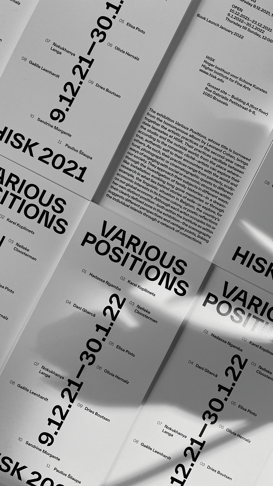
The exhibition brings together the artistic practices of the second-year candidate laureates at HISK. Their practices vacillate between the studio and the outside world; from the place where - according to the romantic cliché - artists can explore their true, authentic self to their encounters with the world and others. As such, their practices range from painterly, sculptural, photographic or cinematographic quests to different ways of engaging with social or economical structures within our society. They approach their subjects in different ways; through the investigation of family histories - in a dreamlike installation evoking long gone memories or through research in what lies behind stories of exile - or explore, for example, the linguistic situation in Belgium, the country's economic interests in its former colony, or poetic reflections on our global economy. Although each artist occupies his or her own distinct position - both within the institute as within their clearly defined zone in the exhibition - the scenography suggests different perspectives and vantage points, linking the individual islands through a network of connections.
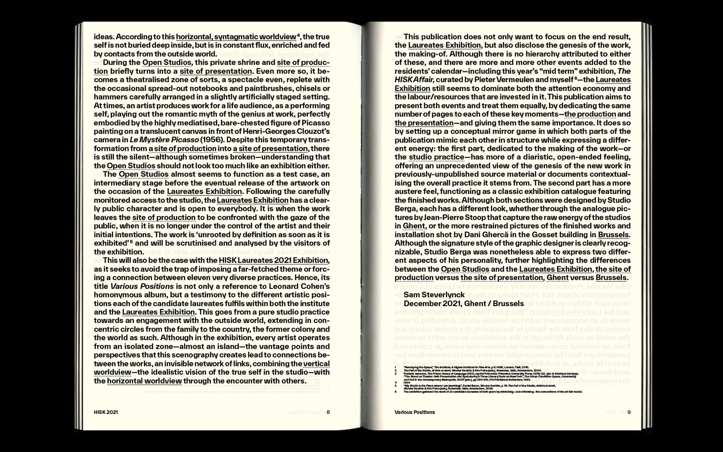
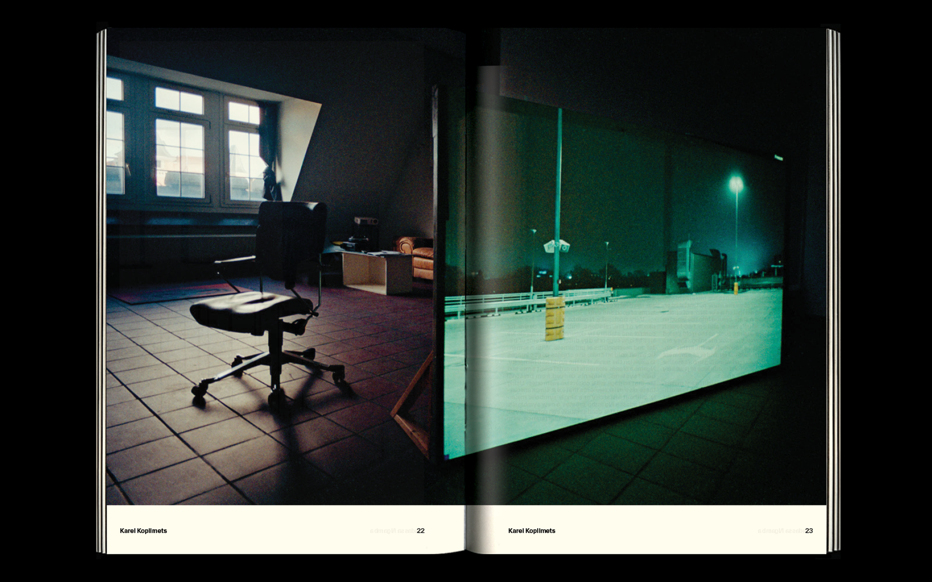
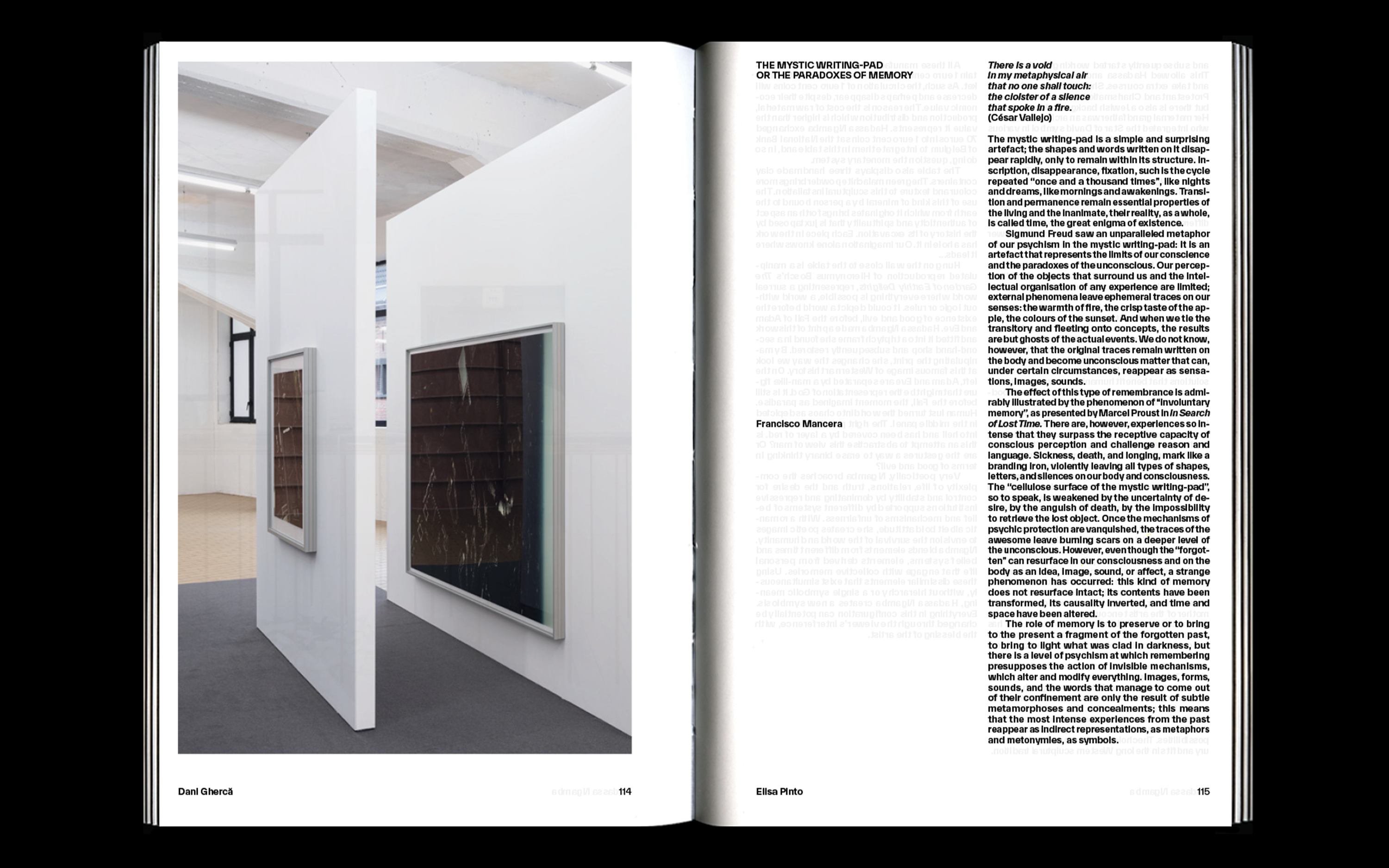
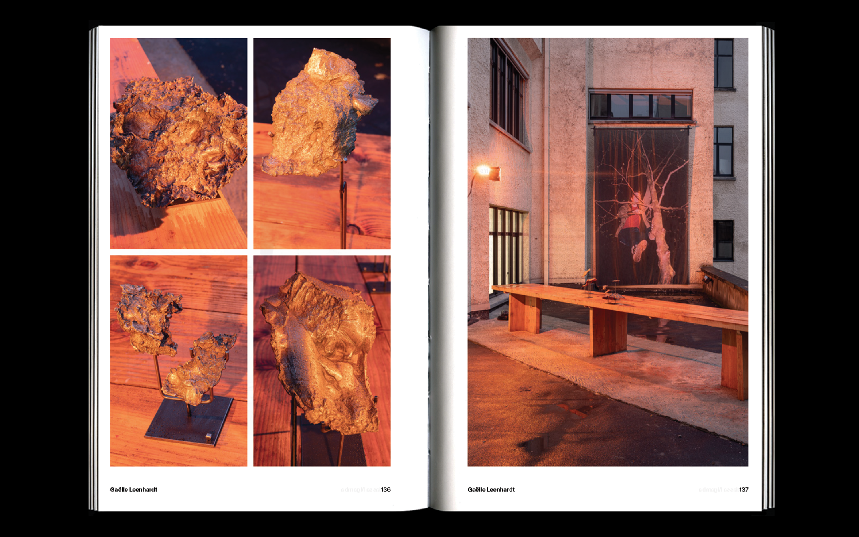
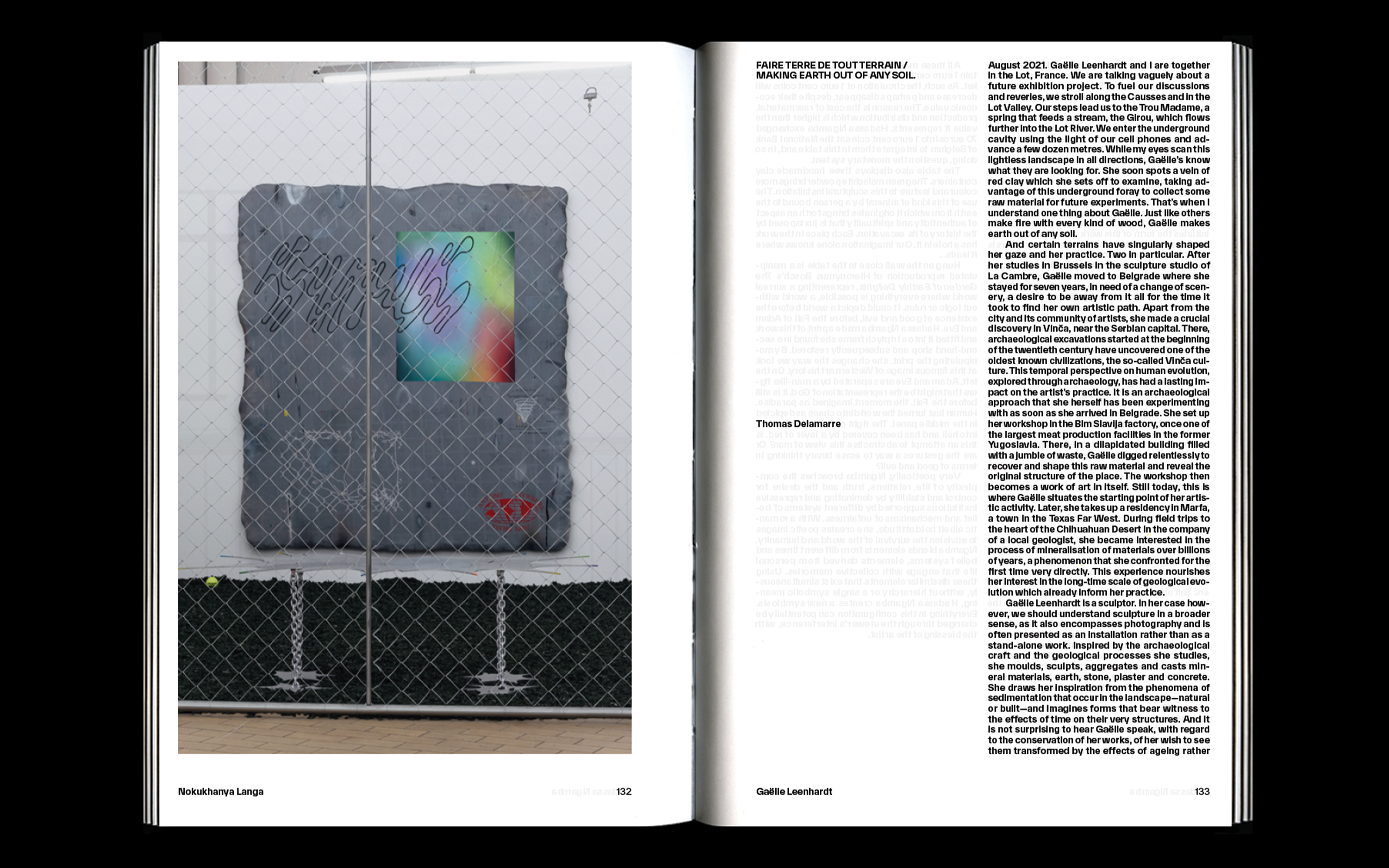
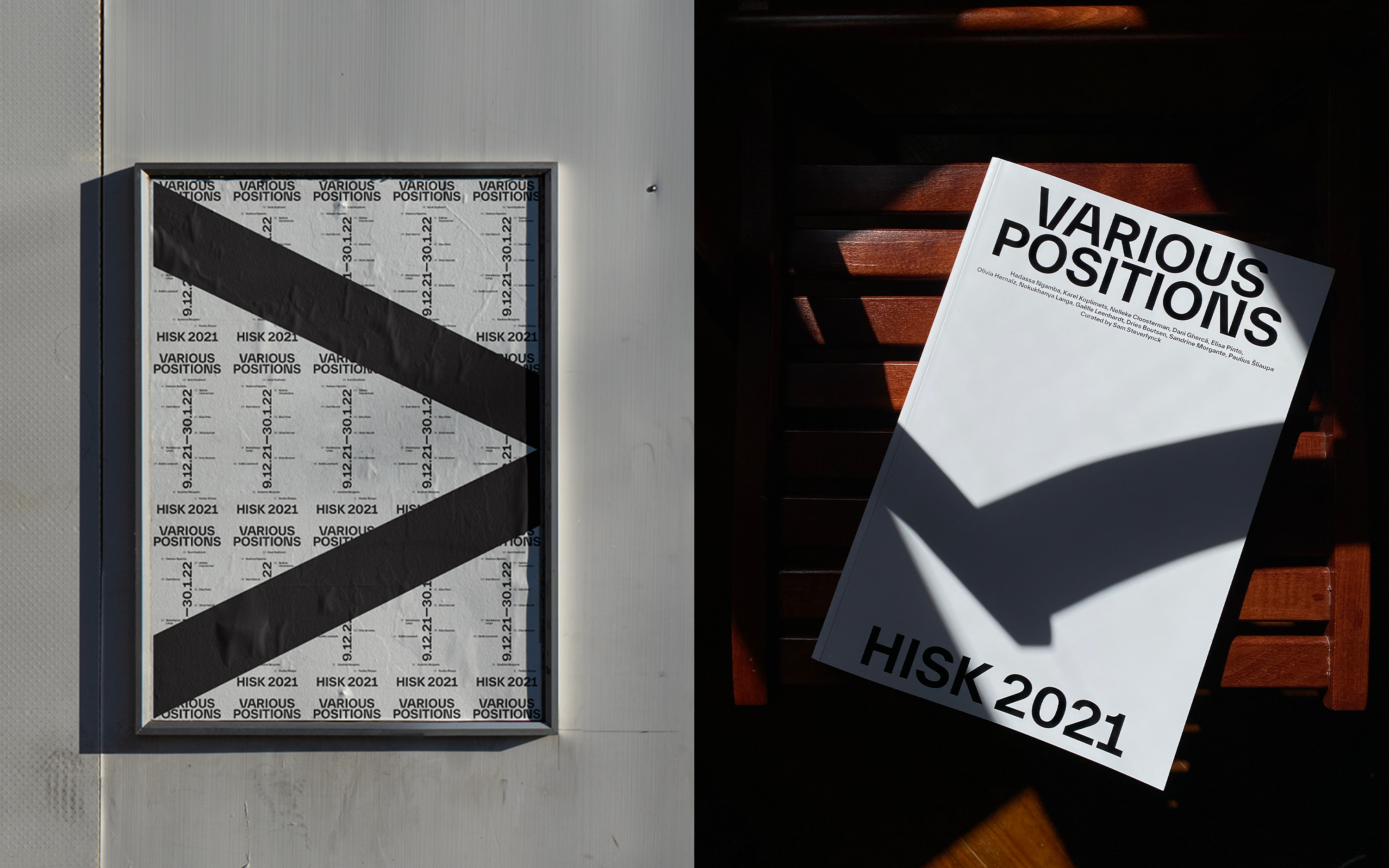
Together with HISK and Sam Steverlynck we worked on the visual identity for the exhibition and the catalog. Our goal was to create something strong and refined that would help showcase the work of each artist. The visual identity was based on the location of the artists in the final exhibition. The publication didn’t only want to focus on the end result, the Laureates Exhibition, but also disclose the genesis of the work, the making-of. Although there is no hierarchy attributed to either of these, and there are more and more other events added to the residents’ calendar—including this year’s “mid term” exhibition, The HISK Affair, curated by Pieter Vermeulen and Sam Steverlynck—the Laureates Exhibition still seems to dominate both the attention economy and the labor/resources that are invested in it. The catalog aims to present both events and treat them equally, by dedicating the same number of pages to each of these key moments—the production and the presentation—and giving them the same importance. It does so by setting up a conceptual mirror game in which both parts of the publication mimic each other in structure while expressing a different energy: the first part, dedicated to the making of the work—or the studio practice—has more of a diaristic, open-ended feeling, offering an unprecedented view of the genesis of the new work in previously-unpublished source material or documents contextualizing the overall practice it stems from. The second part has a more austere feel, functioning as a classic exhibition catalog featuring the finished works. Although both sections were designed by Studio Berga, each has a different look, whether through the analog pictures by Jean-Pierre Stoop that capture the raw energy of the studios in Ghent, or the more restrained pictures of the finished works and installation shot by Dani Ghercă in the Gosset building in Brussels. Although the signature style of the graphic designer is clearly recognizable, Studio Berga was nonetheless able to express two different aspects of his personality, further highlighting the differences between the Open Studios and the Laureates Exhibition, the site of production versus the site of presentation, Ghent versus Brussels.


